4days of intensive immersion, homework, homework, homework, then 1 exam every day for 5 days.
Then home.
Be nice to me, Phoenix.
Saturday, February 26, 2011
Sunday, February 20, 2011
My Latest Painting: Polar Reflections - Derwent Inktense on 9x12 Smooth Bristol

I really like this! It is based on an image I found on the internet, all I know about the artist is her name is Natalie. The original had no color, just india ink and white. I really like the colors.
My husband didn't know what the "things" were under the bear's feet. It is the bear's reflection on the ice. :)
I'm learning more how to use the Inktense pencils. Pretty cool. I would like to get some liquid watercolors...yet another item on my wish list.
I sure wish someone would donate to my art supply fund!
Back to studying today, I go to Phoenix a week from today and have a LOT to finish up before I go.
Pray for me, that it will be a good, successful trip and my body will cooperate.
Too Much Studying
Makes my eyes cross. Not the most exciting topics but very necessary to learn. It's not quick reading either.
I decided to do a little painting tonight, to try out my Derwent Inktense pencils again, I'm happy with how it turned out. It's not an original created by me, I found the image on Google and decided to see if I could paint a close likeness. I'm still new to this so I haven't figured out my own style yet.
I will post it tomorrow
Tuesday, February 15, 2011
Hiker. ShinHan Art Touch Twin markers on 11x17 Smooth Bristol

It's DONE! I might go in and do some highlighting with white colored pencil or Conte crayon but for right now, I'm satisfied. :)
I should put my art aside for a few weeks and really focus on getting my Virginia Commonwealth University reading done so I will be prepared for my class I will be taking in Phoenix in a couple of weeks. The reading is putting me to sleep. I don't know who put it all together, but it is sooo repetative it's silly.
It's been a stressful week and this marker painting has really helped but I need to focus my attention on school :( Too bad we can't just play for a living :)
Monday, February 14, 2011
More Peeks: 11x17 ShinHan Art Touch Twin Marker on Bristol
I forgot to post yesterday so here are 2 pictures :)
I hope everyone has a lovely Valentine's Day!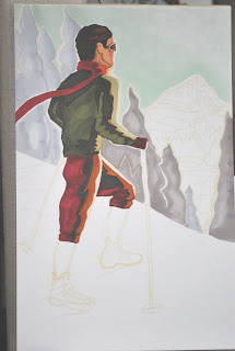

I hope everyone has a lovely Valentine's Day!


Saturday, February 12, 2011
Sneak Peek #2 Touch Marker Drawing And Maybe I should learn How To Draw

My vintage hiker drawing is coming along nicely. I love these Touch markers! I have a lot of markers but am finding I really need more colors. I've been layering colors to make new colors which works when I need a darker color but I can't make a darker color lighter. But so far so good.
I have been thinking that maybe I should learn some real drawing techniques.
So I ordered some books on drawing:
How to Draw What You See
Basic Colored Pencil Techniques
the Drawing Bible
and I am excitedly awaiting "Markers Wet and Wild". It's an older book from the early 90's and I got it for $8 and $3 shipping so WooHoo!
Friday, February 11, 2011
Sneek Peek
11x17 on Strathmore 300 smooth Bristol
ShinHan Touch markers:
Sketch 109 Pearl White
SKY 179 Aqua Mint
Trees CG0.5, CG1, WG2, 169 Putty

ShinHan Touch markers:
Sketch 109 Pearl White
SKY 179 Aqua Mint
Trees CG0.5, CG1, WG2, 169 Putty

Copic Markers - part 3: Response from Copic regarding Splotchy, Speckled, Mottled Inks
This is the last reponse from the Copic Product Specialist. As a reminder, I have been having ink quality issues with some of the markers. I use some Copics and all is fine, then I use some other Copics - on the same piece of paper - and get mottling, speckling or splotchy ink. Since it's the same paper where the other Copics worked fine, I have been questioning their consistance of the quality of the ink from marker to marker.
Copic Product Specialist:
"OK, I heard back from the manufacturer. There is a physical difference between the drying agents of the Copics and the other marker brands listed. It has nothing to do with the markers left in the cold.
Copics have a faster drying time than Blick, Touch etc. This was desirable because it meant that they could produce crisper lines and a more vibrant color-range, less streaking, and low odor.
The slower drying markers absorb into the paper a little differently. So the manufacturer consciously chose that more vibrant colors and crisper lines were a good trade for seeing the fibers a bit more. "
See the other 2 posts below for the beginning of this Copic known issue.
Copic has a much more extensive color range than any other marker brands that I have researched but other markers, like Touch are low odor to odorless, with vibrant colors and Touch are low to no streaking (depending on your individual technique).
So there you have it, if you are experiencing this, it is not "just you", "the wrong paper" or even the wrong technique. It is the ink in some of the Copic markers causing the paperfibers to become visible, due to dye density and drying agents in some Copic markers.
As the Product Specialist said, it was a trade-off. So now it becomes the consumers decision if they want the color range and visible paper fibers or not. I personally do not want it unless I put it there on purpose. I am doing a large marker painting and wanted to use a Copic color I have but I know this one has the fiber/mottling problem...I don't have the Touch marker color I need so I will be changing colors from my original plan. Frustrating.
I do wish Touch had more colors because I just can't get enough colors, haha! But life is good and enjoy your markers, whatever your favorite is!
Wednesday, February 09, 2011
More Information on Speckled, Splotchy or Mottled Copics Coming Tomorrow
Got more information from Copic regarding the known issue with some of their inks, too late tonight, will post it tomorrow
Monday, February 07, 2011
Splotchy/Speckled Copic Markers: Reply from Copic Product Consultant
I got a response from a product consultant for Copic:
"The splotchiness you see is because paper is made out of fibers from trees, which, depending on the milling, absorbs ink differently.
Each marker brand reacts differently with the fibers of each paper brand. It also depends on the density of the dye particles for specific colors - so darker colors may not absorb in the same manner as light colors.
When magnified, yes, it is easy to see the grain from the markers/paper. This is a known issue, but it also a matter of the nature of the medium.
Colored pencils look a certain way, watercolors look a certain way, waterbased markers look one way and Copics look another. Whatever medium you choose to work with is up to you. If the results are not acceptable with one medium, then it is a personal choice."
So the way I read this is that the splotchiness, blotchiness, speckled inks are caused because the density of the dye particles in some of the Copic colors are different then the dye partical density in other Copic colors. These to me means the inks are not the same so they react differently to the same piece of paper. Which is shown in my test swatches in the previous posts. So the quality of the ink isn't consistant between markers..but if a person is lucky, they might happen to find a paper where the inconsistancy is minimized...that's a lot of work and expense just to find a paper where all Copics are happy.
While I appreciate the information that it is a known issue, that last paragraph seems a bit.....so if I don't like the "know issue", it's a personal choice.
I disagree. I think any artist or hobbyist who cares about their work and pays premium price for a proclaimed premium marker has the right to expect premium and consistent quality and not have to make a personal "choice" to accept less.
But she did bring up a point I did not address so I will here:
It doesn't take ANY magnification to see any of this speckling/mottling. I can see it on the 2x3 inch test swatch standing 5 ft away. The problem is obvious enough on it's own that it does not need any enhancement in any way.
None of the test swatches below were magnified - 2 of them are at real size and the rest of the scans are SMALLER than the actual size and the speckling is obvious.
So now we know. Copic's dark inks can absorb differently than their light inks and papers definitely enhance or minimize this known issue.
So lets get down to personal choices
Copic: expensive, hit and miss quality depending on the color, fussy with paper. If that is for you, then this marker is for you. In good conscience, cannot recommend them, especially when Copic knows about the issues and still charge the prices they charge.
Touch: affordable, loves almost all flavors of paper, consistent, premium inks in every color. I can give an honest, favorable opinion of these markers and recommend them for people who care about quality over a brand name.
I work too hard for my $ and I work to hard on my art and hobbies to pay extra money for speckled/mottled inks.
Saturday, February 05, 2011
Touch Marker English Website is UP!
ShinHan Arts now has their English website up! It mentions the refillable and replaceable nibs as well as brush markers! Check them out in the PDF catalogue
http://www.shinhanart.com/
http://www.shinhanart.com/
Copic Marker Review: Are Copics REALLY the Best?
I LOVE my markers! I love the colors and how easy they are to use. I have several brands of markers; Copic, Touch Twin, Dick Blick and no longer made Design markers. I recently updated my color swatch chart. While looking it over, I noticed that most of my Copics were splotchy and mottled looking compared to the Touch and Dick Blick swatches. Hmmm..Copics are considered the premium markers out there. There is a lot of really great tutorials on how to use them and classes available and so on. They are easy to find but not easy to afford, with prices from $3.50 to $7 for each marker.
ShinHan Touch Markers can be very hard to find information on and where to purchase. They are HUGE in the asian market and are made in Korea. I found them sold at Dick Blick and the price was much less, I got them for $2.09 per marker on clearance (ShinHan is coming out with a new marker style early summer 2011 which will be refillable and replaceable nibs as well as brush styles). I also got a few Dick Blick brand markers to fill in colors I didn't have. Touch are also available online at Pearl Arts, Jerry's Artarama and several people have good results on Ebay. Some stores carry them locally.
So back to the mottled Copics. I posted on Split Coast Stampers (SCS) asking if anyone knew why I was having this problem with Copic? I didn't get very many responses but had some good suggestions that it might be the paper, inadequate saturation or using not using enough ink, ect.
Well, I spent good money on these Copics and I really want them to work and look nice so I had better find out what is going on. I was given some different paper samples by some SCS so I decided to see if it is my paper and what more or less ink would do.
After seeing the Copic results, I decided to see how the Touch markers compare and also did one swatch with a Dick Blick marker.
Very interesting results...and not in Copics favor. But some very useful findings about what papers work better with Copics and which to avoid. Paper definitely has an effect on Copics, as you will see in the following pictures. They also effect Touch and Blick, but not to the degree as Copics.

Copic Blending: This is a smmmoooth paper. The markers move nicely on it. However, I found that all of the pens can leave puddle of wet ink on top. It quickly absorbs in but if someone isn't careful, I think they could smear this puddle before it dries. Mottling on G07, YG23, YG45, E44 Copics. Trace mottling on 47 and 100 Touch and DB. This mottling is a bit different. It almost looks like there are shiny areas embedded in the paper or maybe the slick coating on this paper isn't consistence. When this is looked at in person, it looks like shiny flecks.
 Gina K. heavyweight. This paper is VERY heavy! There is absolutely NO bleedthru on the reverse of the paper. It is fairly smooth feeling. However, I would NOT recommend this paper with Copics. As you can see, there is major mottling with the Copics, in every color. There is less noticeable mottling with Touch but still on an unacceptable level, with the worst being 47.
 Next is SU card stock. When I put my marker on this paper I said "awww..", the markers glide over this like skated on ice. I thought this would be it. But it's not. It is on the same level as the Gina K. above. Serious mottling in all colors. Not recommended for Copics at all.
ShinHan Touch Markers can be very hard to find information on and where to purchase. They are HUGE in the asian market and are made in Korea. I found them sold at Dick Blick and the price was much less, I got them for $2.09 per marker on clearance (ShinHan is coming out with a new marker style early summer 2011 which will be refillable and replaceable nibs as well as brush styles). I also got a few Dick Blick brand markers to fill in colors I didn't have. Touch are also available online at Pearl Arts, Jerry's Artarama and several people have good results on Ebay. Some stores carry them locally.
So back to the mottled Copics. I posted on Split Coast Stampers (SCS) asking if anyone knew why I was having this problem with Copic? I didn't get very many responses but had some good suggestions that it might be the paper, inadequate saturation or using not using enough ink, ect.
Well, I spent good money on these Copics and I really want them to work and look nice so I had better find out what is going on. I was given some different paper samples by some SCS so I decided to see if it is my paper and what more or less ink would do.
After seeing the Copic results, I decided to see how the Touch markers compare and also did one swatch with a Dick Blick marker.
Very interesting results...and not in Copics favor. But some very useful findings about what papers work better with Copics and which to avoid. Paper definitely has an effect on Copics, as you will see in the following pictures. They also effect Touch and Blick, but not to the degree as Copics.
All papers are layed out the same way - Copics on top, Touch below and the Lilac is Dick Blick. Each color has the same number of strokes, the darker part of the color has 3 strokes, the lighter shade at the bottom is a single stroke. Looking at the back of the papers, they are all saturated at the same level. I have picked out the closest in color and hue of my Touch markers to match my Copics.
To define the problem clearer, I am finding Copic inks "mottle" when they dry. This means that the ink had lighter or white specks throughout, rather than consistent coverage.
 PTI 110 - Obvious mottling on G07, YG 23 and YG 45 Copic. Some mottling on Touch 100 and maybe a tad in 102, but at acceptable level. DB (Dick Blick) looks pretty good also.

Copic Blending: This is a smmmoooth paper. The markers move nicely on it. However, I found that all of the pens can leave puddle of wet ink on top. It quickly absorbs in but if someone isn't careful, I think they could smear this puddle before it dries. Mottling on G07, YG23, YG45, E44 Copics. Trace mottling on 47 and 100 Touch and DB. This mottling is a bit different. It almost looks like there are shiny areas embedded in the paper or maybe the slick coating on this paper isn't consistence. When this is looked at in person, it looks like shiny flecks.
 Gina K. heavyweight. This paper is VERY heavy! There is absolutely NO bleedthru on the reverse of the paper. It is fairly smooth feeling. However, I would NOT recommend this paper with Copics. As you can see, there is major mottling with the Copics, in every color. There is less noticeable mottling with Touch but still on an unacceptable level, with the worst being 47.
 Next is SU card stock. When I put my marker on this paper I said "awww..", the markers glide over this like skated on ice. I thought this would be it. But it's not. It is on the same level as the Gina K. above. Serious mottling in all colors. Not recommended for Copics at all.
 BUT...the Touch markers and DB worked pretty good with this paper. Slight mottling in the darker colors, nothing in the lighter colors.
 Wausau/GP - I think this is available at Walmart but I could be wrong. It isn't the brightest white and I would not use it with Copics. Like SU and Gina K. above, it doesn't play well with Copics. Obvious mottling in all colors.
 Wausau/GP - I think this is available at Walmart but I could be wrong. It isn't the brightest white and I would not use it with Copics. Like SU and Gina K. above, it doesn't play well with Copics. Obvious mottling in all colors.
 Touch - does pretty good with Touch and DB markers. Colors don't look quite as bright on this paper as the others. I think it suck in more ink than the other pages also.
 Papertrey PTI medium. This has the roughest feel of all my samples, but it's a keeper. Copics look pretty good on this paper, mild mottling in the darker colors. Touch and DB look great. All colors are nice and bright.
 Neenah Classic 80. Obvious mottling with Copics in all colors except R17 and slight in YR68. I would not recommend with Copics because it is very obvious in the greens.
 Works well with Touch and DB, mild mottling in 100 and DB but not on a noticeable level.
 Copic X-Press. Same problem but as Copic Blending but even more. Looks like flecks in the paper, almost like mica flecks in a rock. At first glance, it looks like mottling but on closer inspection, it is flecks in the paper. But they are noticeable and are seen more with the Copics than with Touch markers. DB is too small to evaluate.
 Copic X-Press. Same problem but as Copic Blending but even more. Looks like flecks in the paper, almost like mica flecks in a rock. At first glance, it looks like mottling but on closer inspection, it is flecks in the paper. But they are noticeable and are seen more with the Copics than with Touch markers. DB is too small to evaluate.
 So white spots due to flecks in the paper, which are obvious with Copics.

Bienfang Smooth Bristol Board. This is one of the better/best paper for Copics. Mild mottling, the most noticeable is G07. Touch and DB look very nice, no mottling.
Final Thoughts.

Bienfang Smooth Bristol Board. This is one of the better/best paper for Copics. Mild mottling, the most noticeable is G07. Touch and DB look very nice, no mottling.
This is what I think is going on with Copic inks. These are alcohol based inks. The alcohol carries the pigments and then it evaporates off the paper. As I watched the Copic inks dry, it seems to me that the alcohol might be "puddling" in the light/white areas and there is more alcohol than pigment in the puddle. When the alcohol evaporates, it is lighter or whiter because there was less pigment
Final Thoughts.
Copic need to improve their quality. The quality of ink is not worth the price people are paying. And limited papers that work with these fussy markers just adds to the expense.
Some people have hinted that this is just happening to me...well..no because I found it right on Copic's very own website. Check out the dark side of the cube (E44). http://www.copicmarker.com/tutorials
I understand how people love their Copics, especially if they have never tried any other artist marker brands and have paid big bucks for their collection. If you are happy with your Copics, please continue to be happy with them, I'm not telling you to stop. But before bashing me (yes, I have been bashed for my opinion), try your own tests with an honest evaluation.
I will continue to be happier with my Touch markers - better quality, value and consistency.
Thursday, February 03, 2011
Pink Lady

I really enjoy Samantha Hahn(.com)'s watercolors. This is my version of one of her watercolors but I since I don't watercolor, I used my lovely markers.

I used my Shinhan Touch alcohol markers, Dick Blick Coral Pink marker (worked OK but Touch markers are better) and Beinfang marker paper (which I don't like but need to use it up).
She was fun to draw!
Tuesday, February 01, 2011
Dream it Up!

This is what I whipped out. It certianly isn't going to be a cover of a book. I really don't know if that is doable.
Anyway, I started this with my Inktense pencils but I just don't have enough experience with when it comes to painting with them, so I grabbed a regular #2 pencil and did a lot of rubbing with my finger to blend. Now I have a sore finger :) I couldn't get the dark's any darker, I guess I will have to get some graphite drawing pencils.
I want to try this with my Touch markers but I don't have the right range of grey. But if I did, I think I could do a fairly reasonable job with them and I know how to blend with those.
Life is about to get much busier, I've got my tickets booked to go to Phoenix for my final certification and then a year long apprenticeship type followup. I have to start reading the training materials now because it is a few thousand pages of Soc Sec policy and stuff like that. That's the government for you, they LOVE their policy manuals.
TaTa for now :)
Subscribe to:
Posts (Atom)